
Starbucks – Seasonal Chilled Cup
Defining a product’s tone through packaging
Challenge
Develop the visual concept for the launch of Starbucks’ first chilled coffee with cherry blossom flavour in China.
The product introduced a flavour profile already popular in Japan and adapted it for the Chinese market, with a focus on young female millennial consumers. The packaging needed to communicate spring, romance, and cherry blossom season while preserving the premium character of the Starbucks brand.
The challenge was to create a seasonal design with strong shelf presence in the chilled beverage category. The product needed to feel fresh, elegant, and emotionally appealing at first glance, while still communicating flavour clearly and supporting the overall campaign mood.
Because chilled cups are often discovered in fast retail environments, the design had to work immediately: colour, illustration, composition, and product cues all needed to help the packaging stand out and feel desirable.
The product introduced a flavour profile already popular in Japan and adapted it for the Chinese market, with a focus on young female millennial consumers. The packaging needed to communicate spring, romance, and cherry blossom season while preserving the premium character of the Starbucks brand.
The challenge was to create a seasonal design with strong shelf presence in the chilled beverage category. The product needed to feel fresh, elegant, and emotionally appealing at first glance, while still communicating flavour clearly and supporting the overall campaign mood.
Because chilled cups are often discovered in fast retail environments, the design had to work immediately: colour, illustration, composition, and product cues all needed to help the packaging stand out and feel desirable.
Approach
The visual direction was built around the emotional codes of spring: lightness, freshness, romance, and renewal.
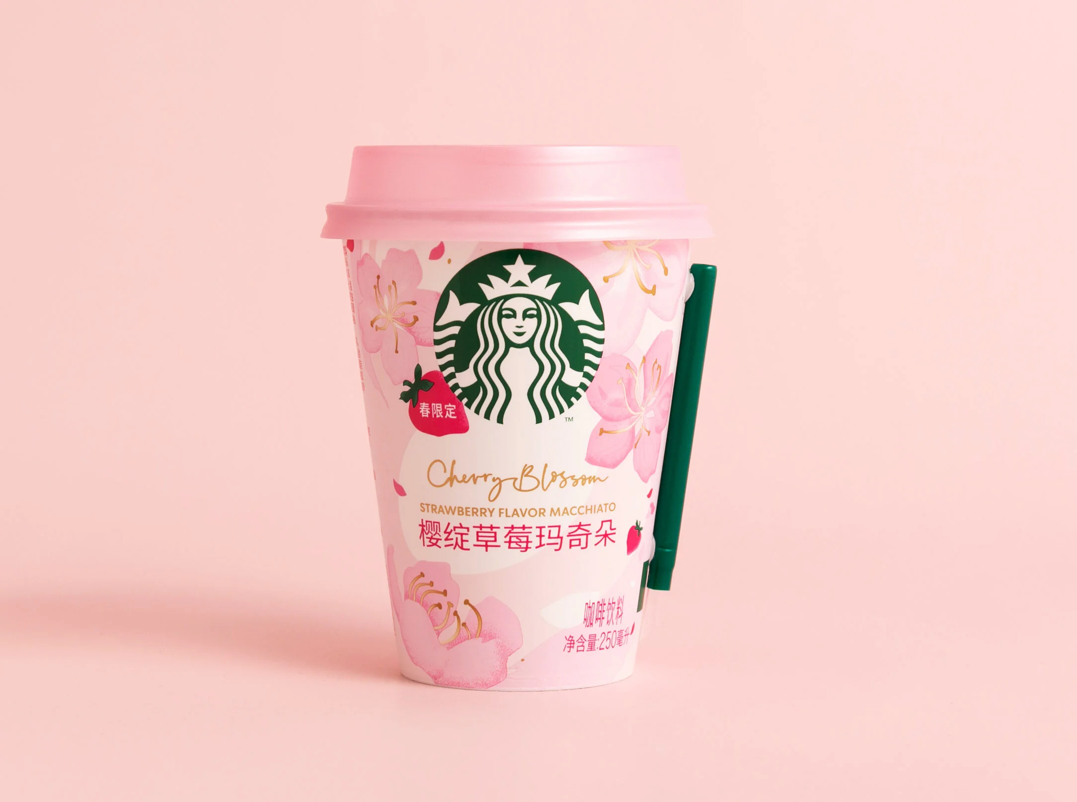
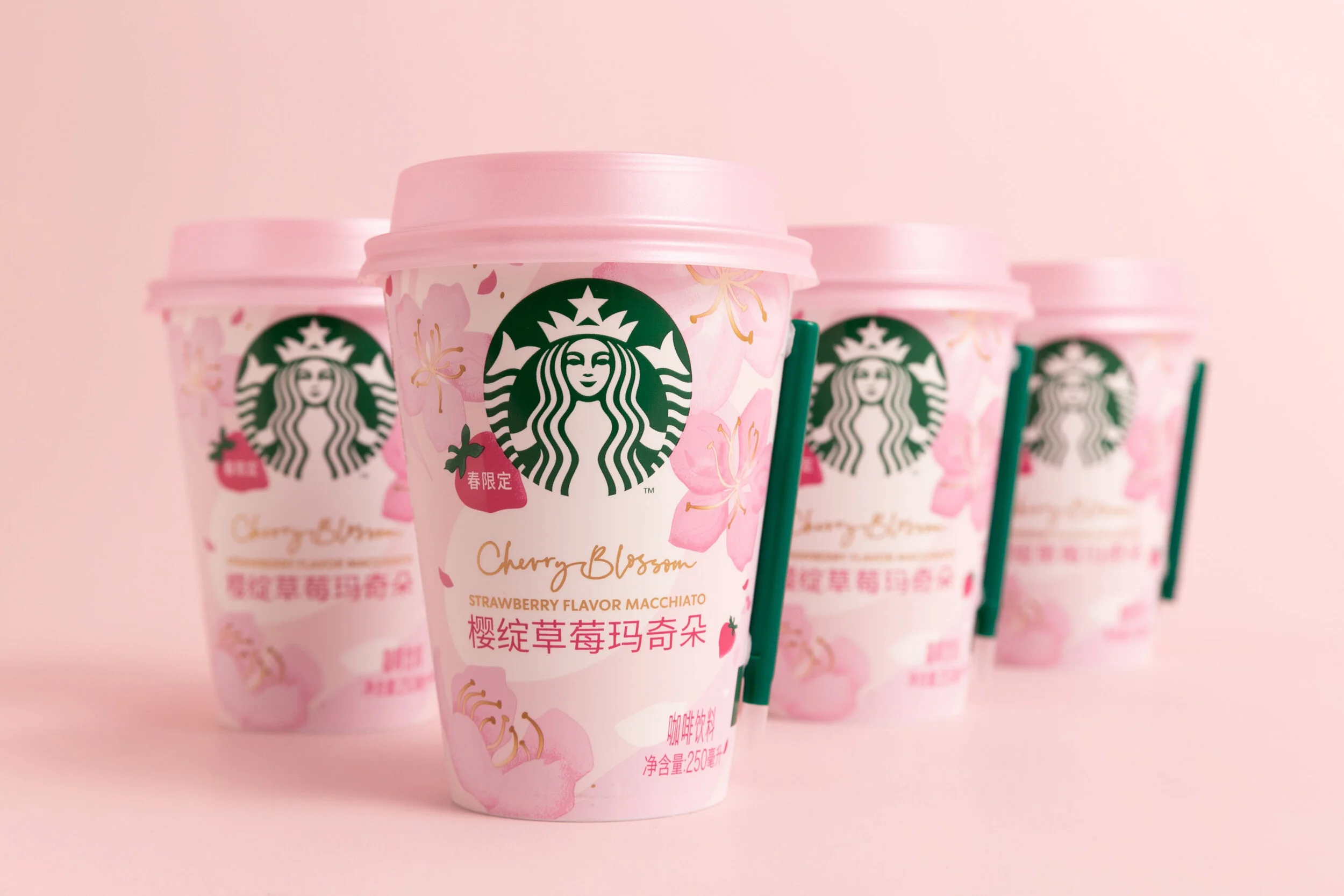
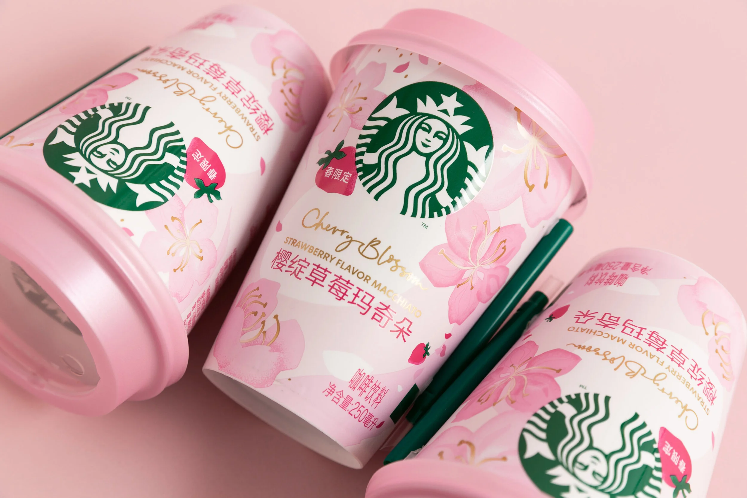
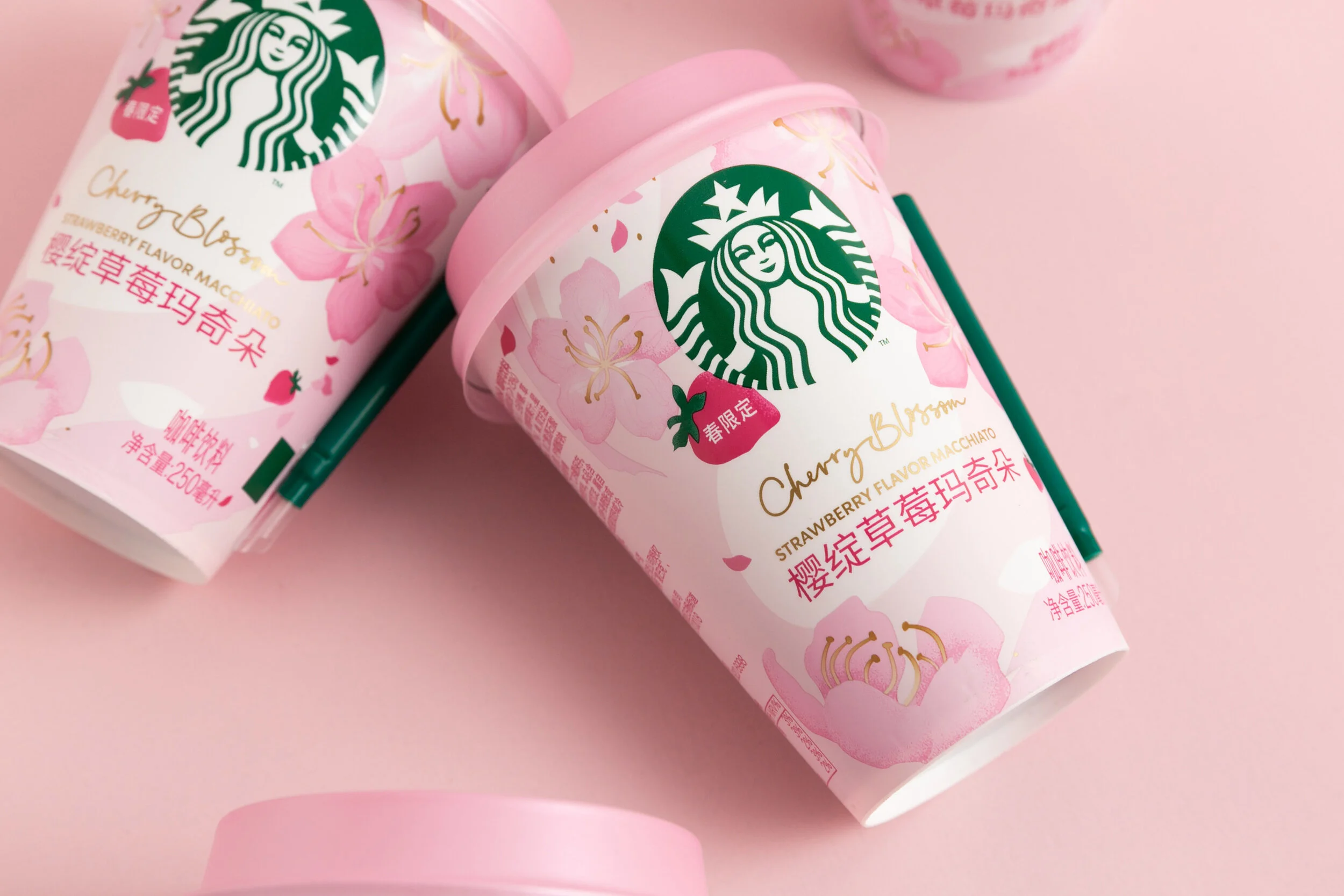
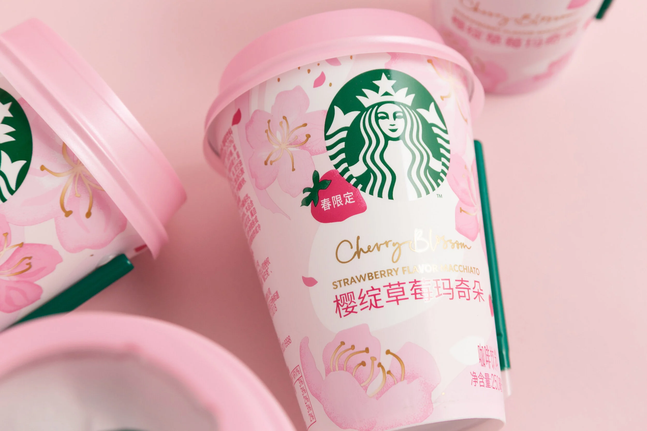
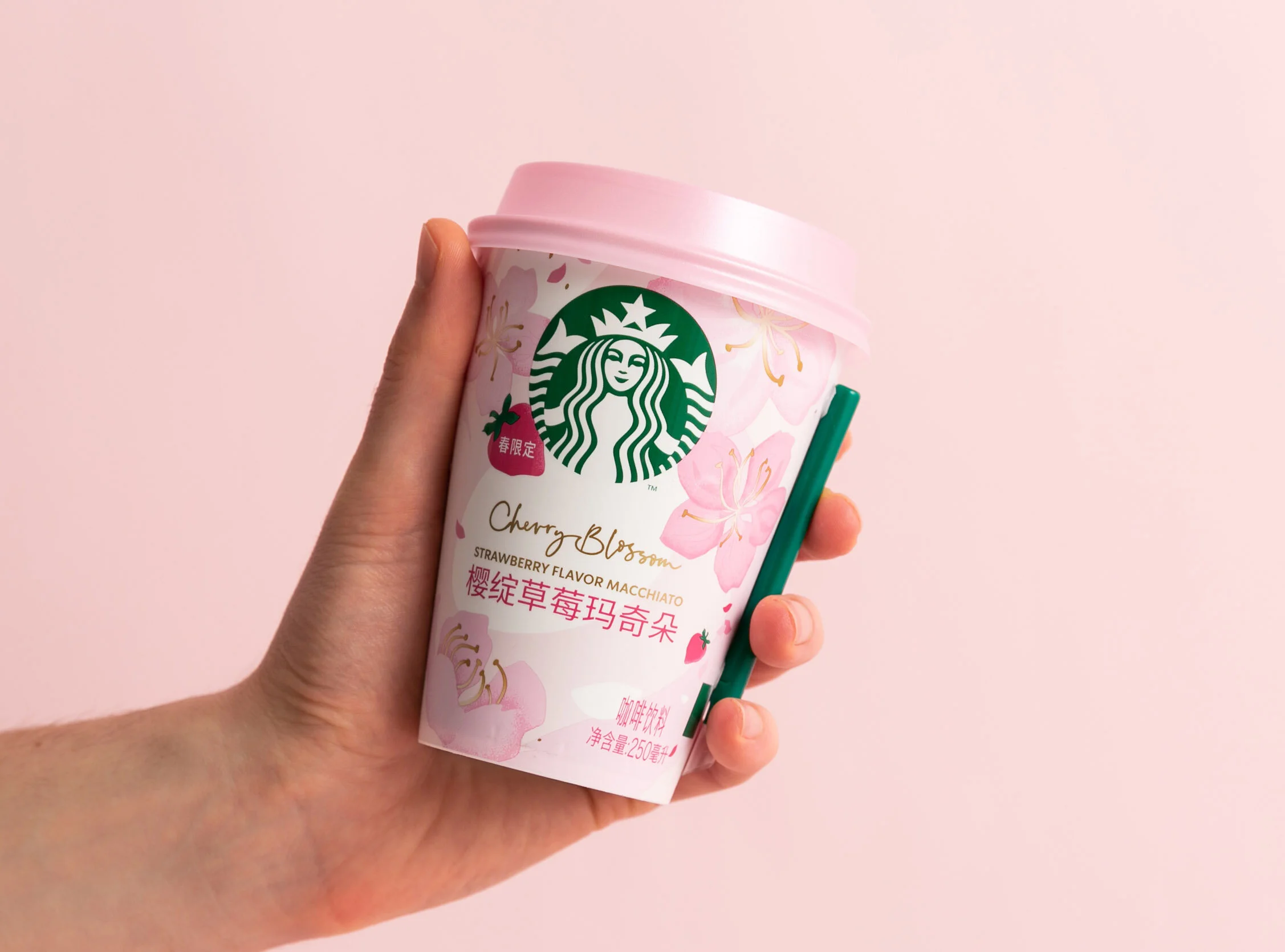
The design used cherry blossom imagery, soft movement, and a delicate colour palette to communicate the flavour and seasonal moment at first glance. The composition was developed to work on a curved chilled cup format, where visibility, hierarchy, and immediate recognition are essential.
The packaging needed to appeal to a young female millennial audience while preserving the premium character of the Starbucks brand. Every element, from illustration to colour balance, was used to make the product feel fresh, elegant, and desirable in a fast retail environment.
The visual language was designed to support both the product packaging and the wider campaign communication, giving the launch a clear seasonal identity across touchpoints.
The design used cherry blossom imagery, soft movement, and a delicate colour palette to communicate the flavour and seasonal moment at first glance. The composition was developed to work on a curved chilled cup format, where visibility, hierarchy, and immediate recognition are essential.
The packaging needed to appeal to a young female millennial audience while preserving the premium character of the Starbucks brand. Every element, from illustration to colour balance, was used to make the product feel fresh, elegant, and desirable in a fast retail environment.
The visual language was designed to support both the product packaging and the wider campaign communication, giving the launch a clear seasonal identity across touchpoints.
Outcome
The campaign introduced a refined visual language built around cherry blossom imagery, soft seasonal movement, and a carefully curated colour palette.
Floral elements and flowing compositions created a sense of lightness and spring atmosphere, while the layout preserved clarity and balance on the cup format. The design gave the product a romantic and contemporary character, aligned with the intended audience and the limited-season launch.
The packaging worked as both a product design and a campaign touchpoint. Applied across the chilled cup and related visuals, the illustration system helped create recognition around the flavour and gave the product a clear seasonal identity.
The result was a packaging concept that positioned the product as fresh, premium, and emotionally engaging. It supported shelf visibility, communicated the cherry blossom flavour, and helped turn a seasonal chilled coffee into a desirable lifestyle product within the Starbucks China range.
Floral elements and flowing compositions created a sense of lightness and spring atmosphere, while the layout preserved clarity and balance on the cup format. The design gave the product a romantic and contemporary character, aligned with the intended audience and the limited-season launch.
The packaging worked as both a product design and a campaign touchpoint. Applied across the chilled cup and related visuals, the illustration system helped create recognition around the flavour and gave the product a clear seasonal identity.
The result was a packaging concept that positioned the product as fresh, premium, and emotionally engaging. It supported shelf visibility, communicated the cherry blossom flavour, and helped turn a seasonal chilled coffee into a desirable lifestyle product within the Starbucks China range.
Client
Starbucks China
Creative Direction
Niccoli.Design