
OSM – Brand System Redesign
From fragmentation to a cohesive, scalable identity system
Challenge
OSM is an Italian business training company supporting SMEs in achieving sustainable growth. With a network of over 160 franchisees across the country, its rapid expansion led to an increasingly fragmented brand perception.
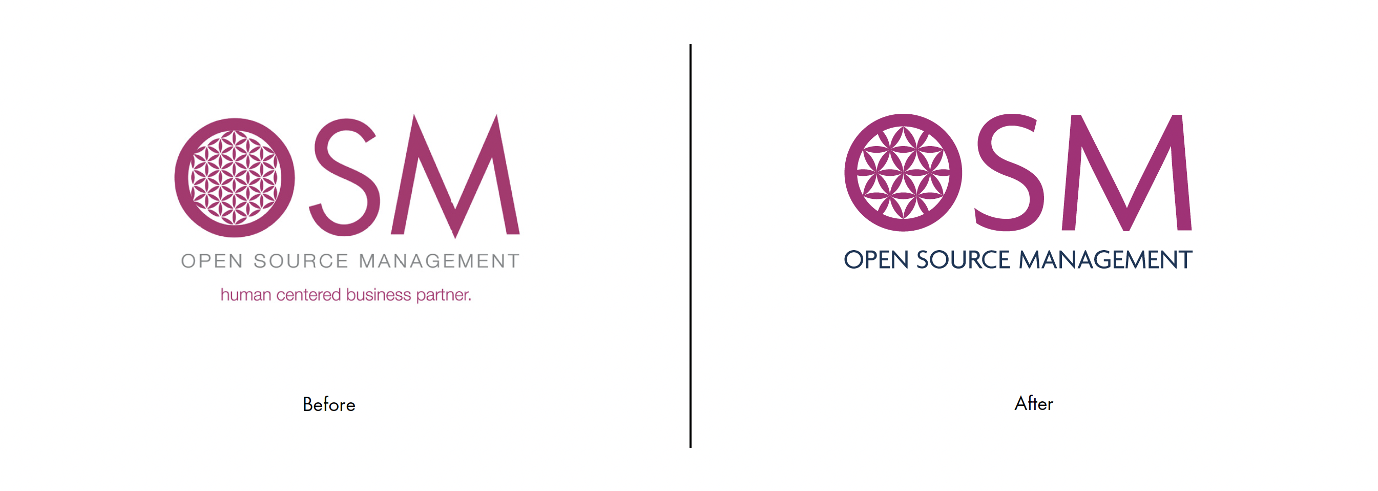
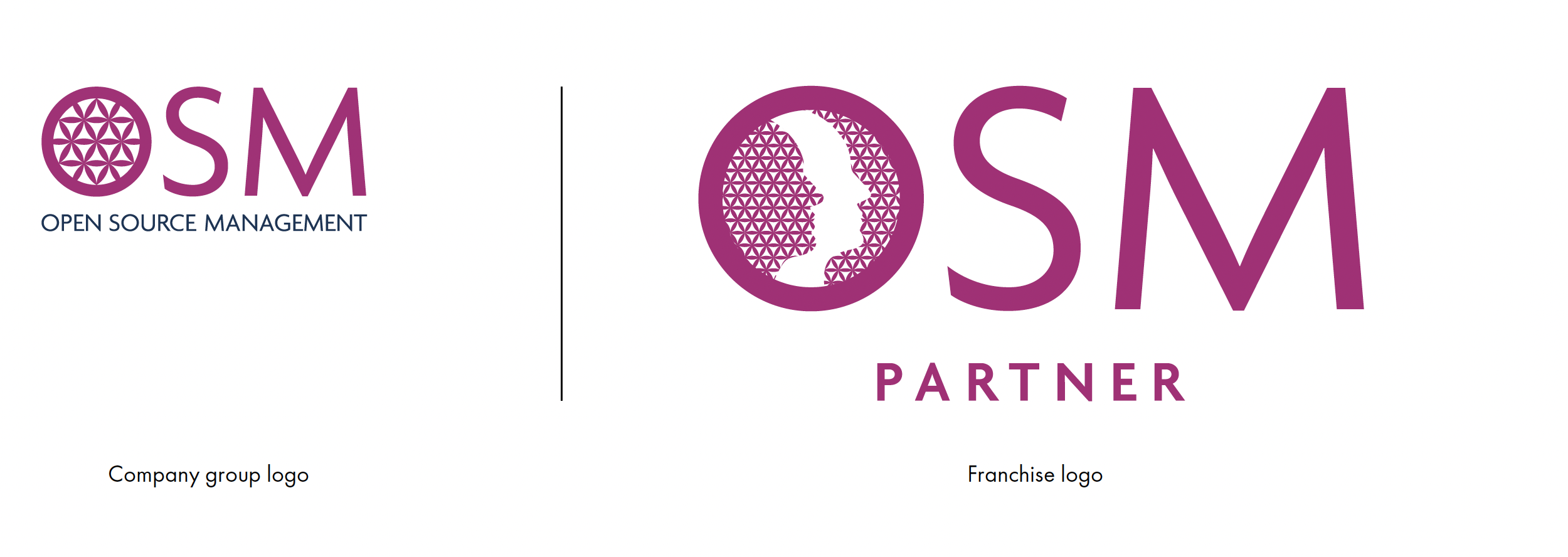
The existing identity lacked clarity and consistency. The logo combined multiple elements that made it difficult to read, while the internal symbol remained visually secondary and underutilized. Across the ecosystem, sub-brands operated without a cohesive structure, often feeling disconnected from the parent brand.
OSM needed a refreshed identity — professional, recognizable, and easy to apply — capable of unifying the brand while remaining flexible enough to support its growing network.
The existing identity lacked clarity and consistency. The logo combined multiple elements that made it difficult to read, while the internal symbol remained visually secondary and underutilized. Across the ecosystem, sub-brands operated without a cohesive structure, often feeling disconnected from the parent brand.
OSM needed a refreshed identity — professional, recognizable, and easy to apply — capable of unifying the brand while remaining flexible enough to support its growing network.
Outcome
The new identity transforms OSM into a cohesive and scalable design system.
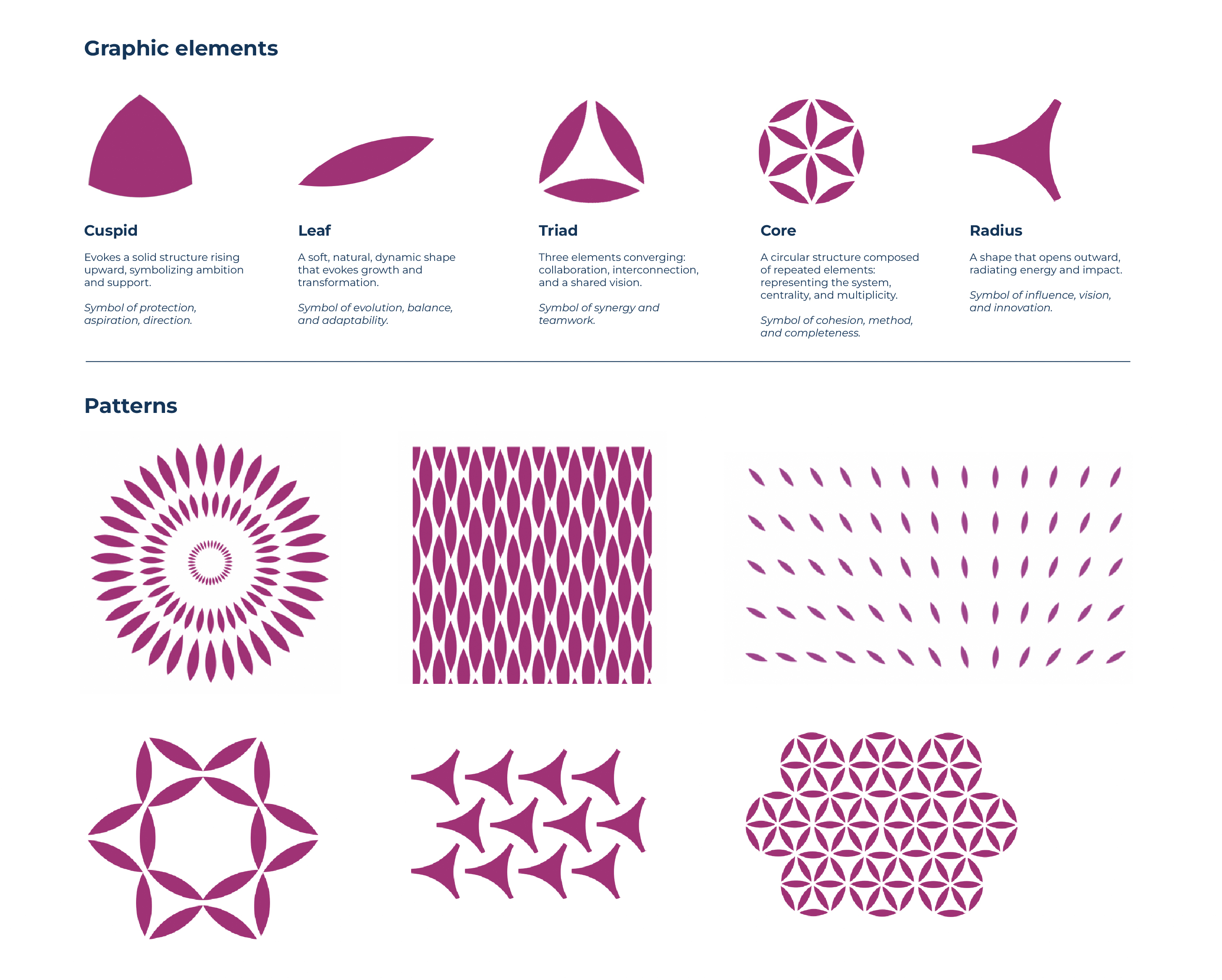
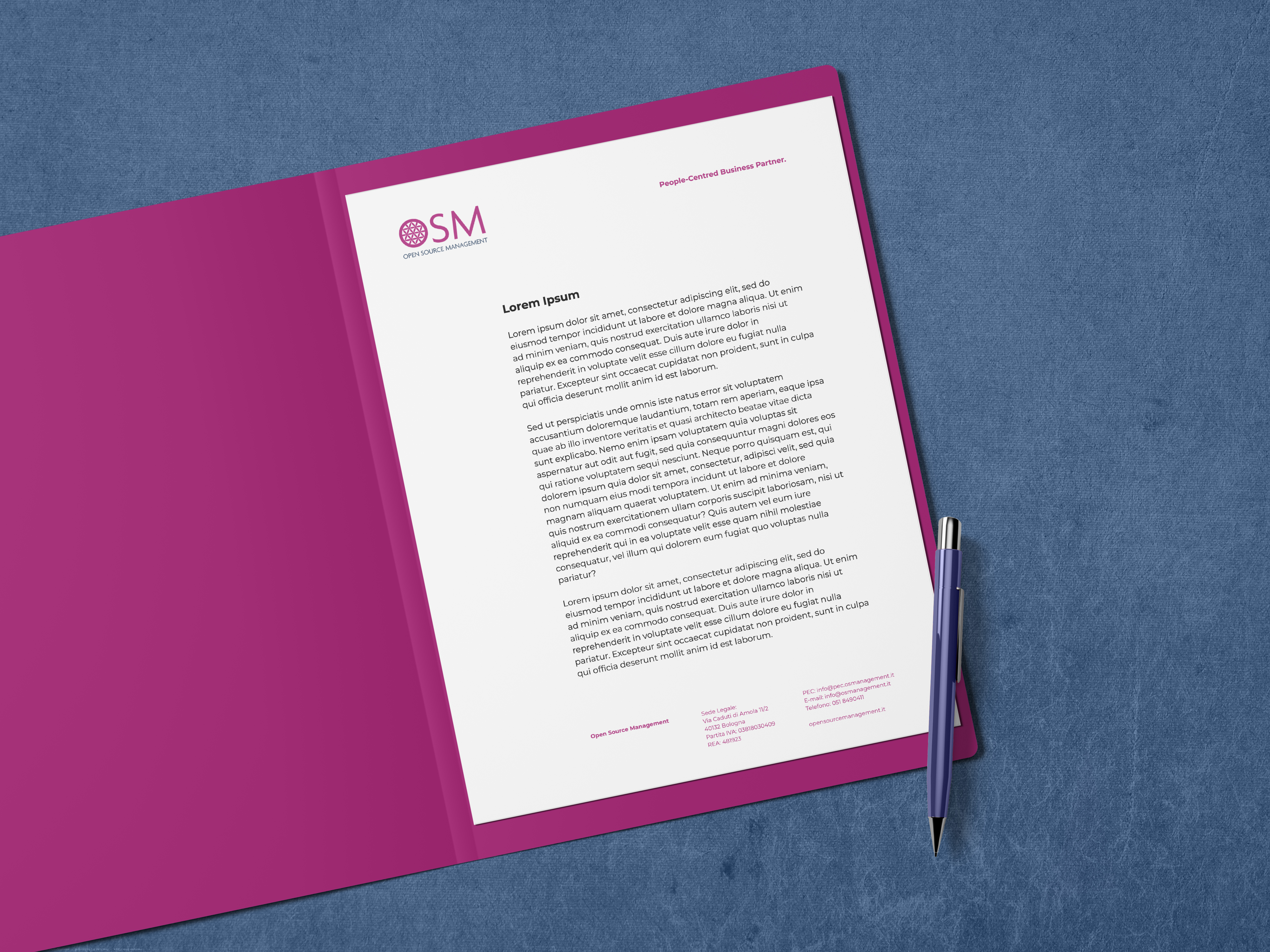
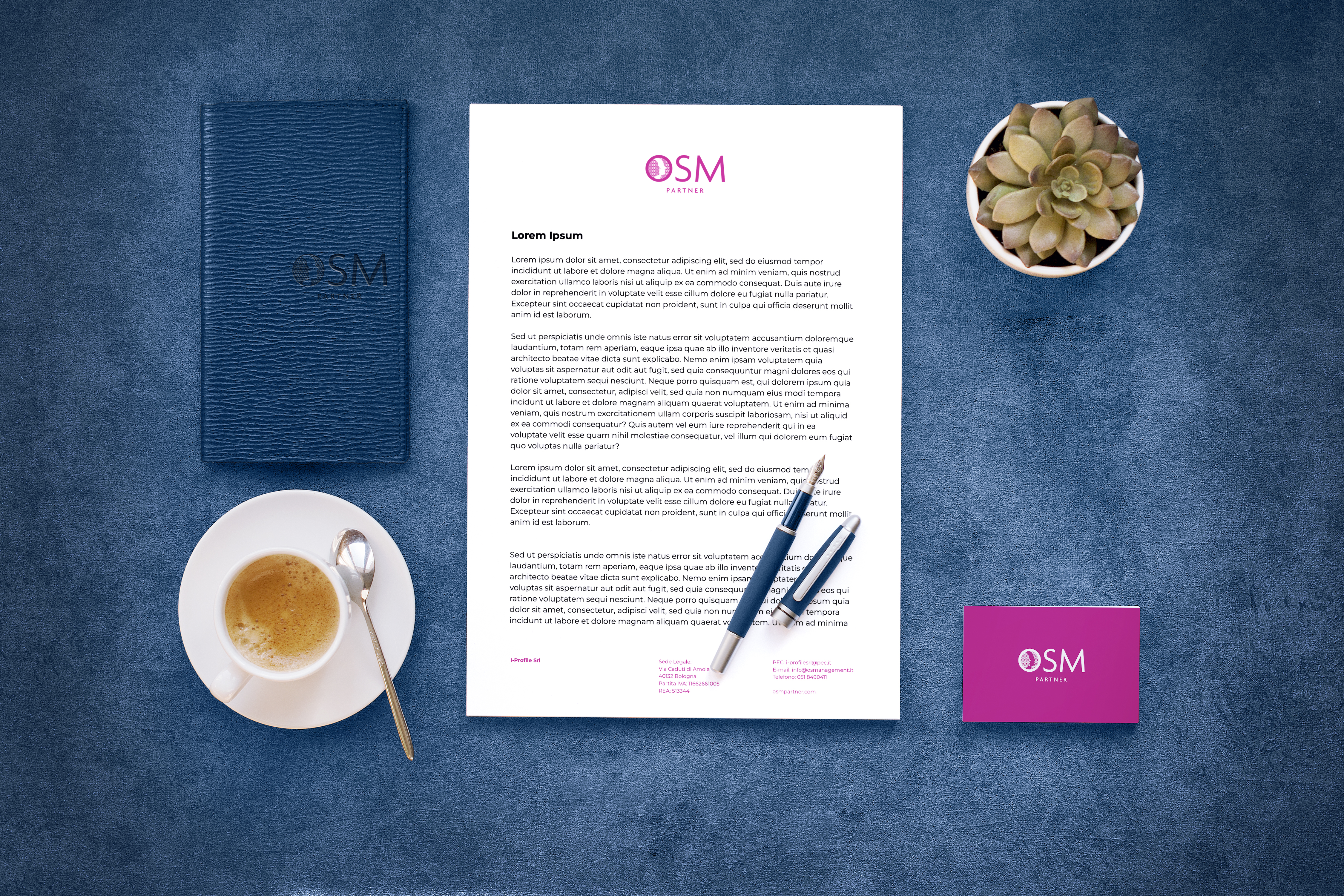
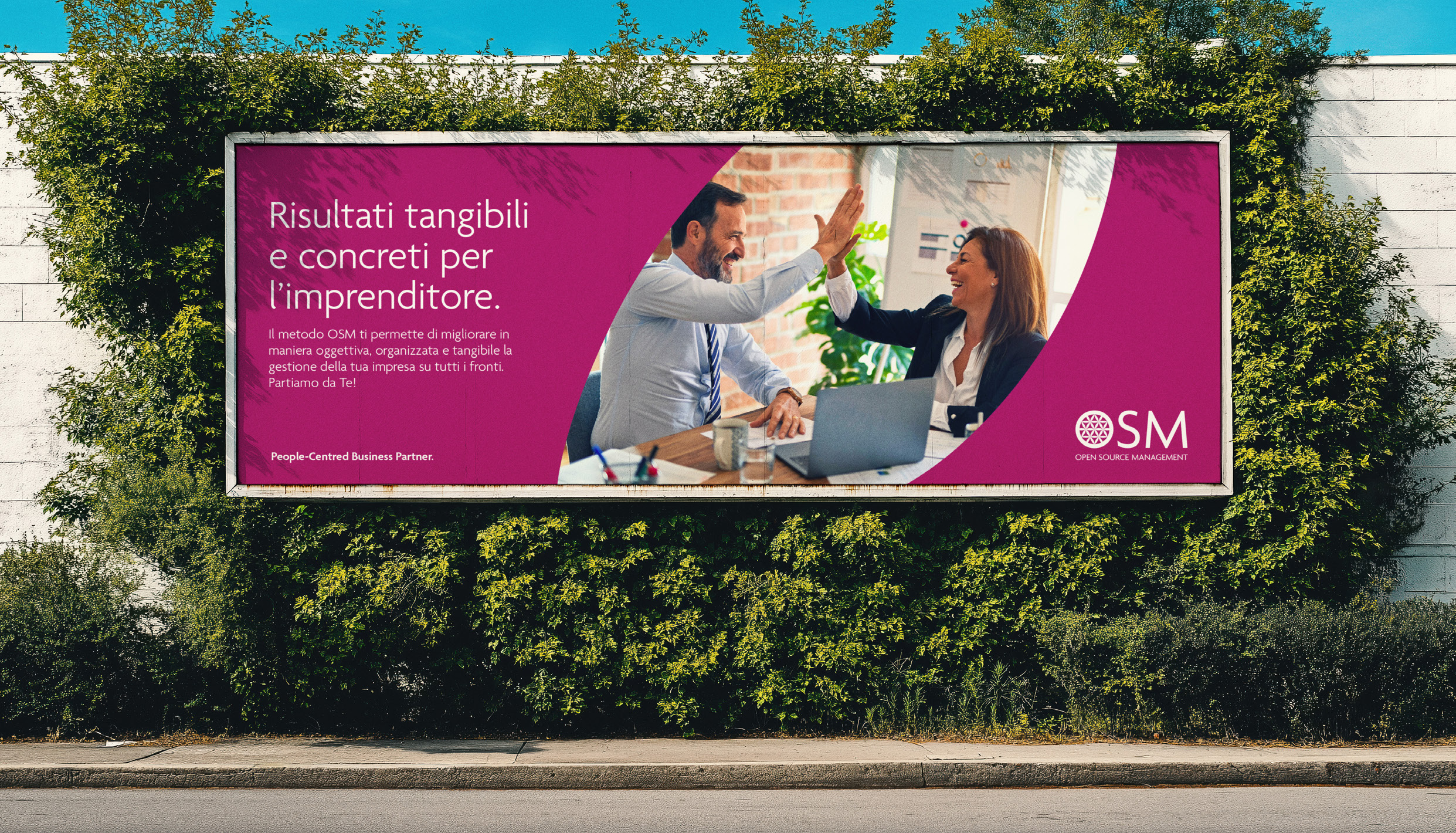
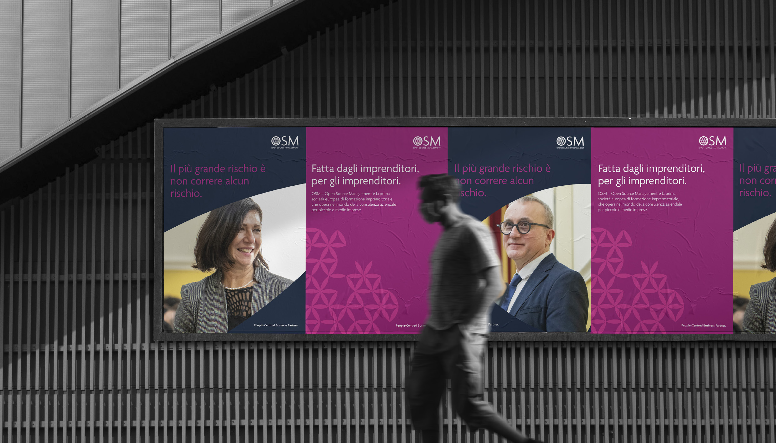
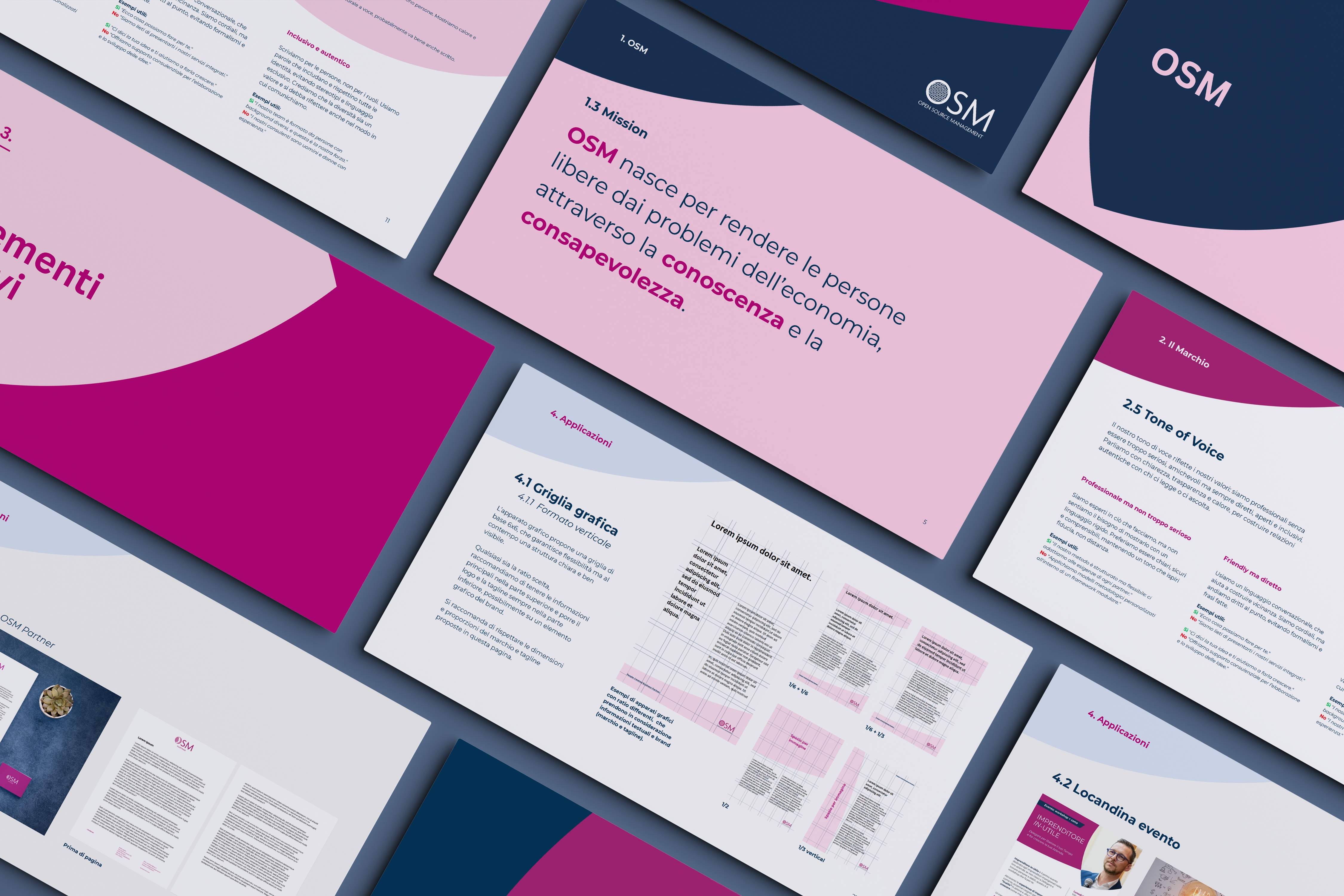
Starting from the existing logo, we extracted its underlying geometric module and developed it into a flexible visual language. Intersecting circular forms generate a dynamic pattern, symbolizing the exchange between OSM and its clients and creating a strong, recognizable system adaptable across sub-brands.
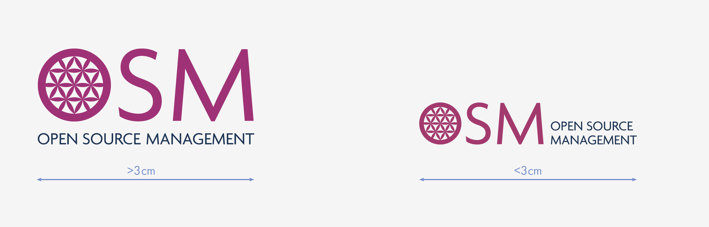
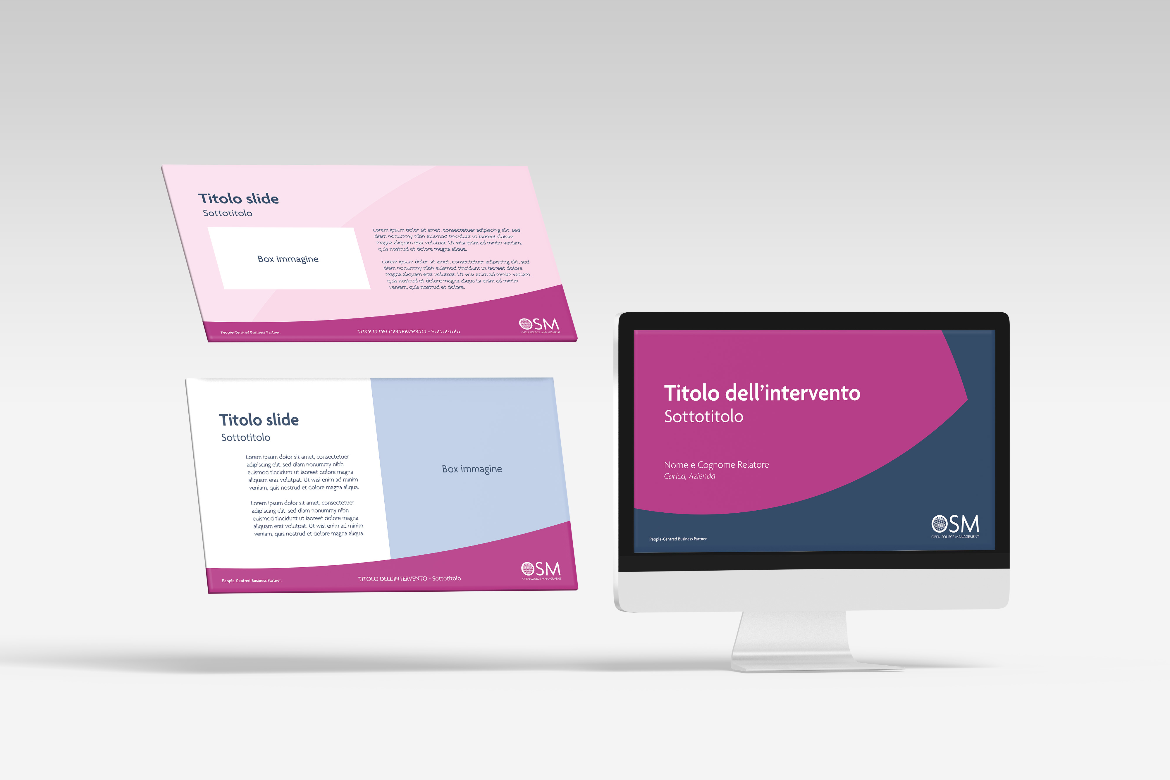
The logo was refined for clarity and impact, enhancing the internal symbol and modernizing the typography while preserving its original character. The color palette was refreshed with a more contemporary primary tone, complemented by blues to reinforce professionalism and visual balance.
The updated tagline, "People-Centred Business Partner," reinforces OSM's positioning as a partner focused on people, relationships, and long-term growth.
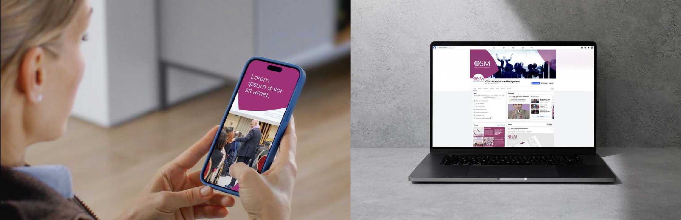
The result is a clear, consistent, and easy-to-implement identity — designed to scale with OSM and strengthen its presence across all touchpoints.
Starting from the existing logo, we extracted its underlying geometric module and developed it into a flexible visual language. Intersecting circular forms generate a dynamic pattern, symbolizing the exchange between OSM and its clients and creating a strong, recognizable system adaptable across sub-brands.
The logo was refined for clarity and impact, enhancing the internal symbol and modernizing the typography while preserving its original character. The color palette was refreshed with a more contemporary primary tone, complemented by blues to reinforce professionalism and visual balance.
The updated tagline, "People-Centred Business Partner," reinforces OSM's positioning as a partner focused on people, relationships, and long-term growth.
The result is a clear, consistent, and easy-to-implement identity — designed to scale with OSM and strengthen its presence across all touchpoints.

Client
Open Source Management
Creative Direction
Ilaria Niccoli