
Starbucks – Mid-Autumn Campaign
Bringing the mooncake tradition to a younger audience
Challenge
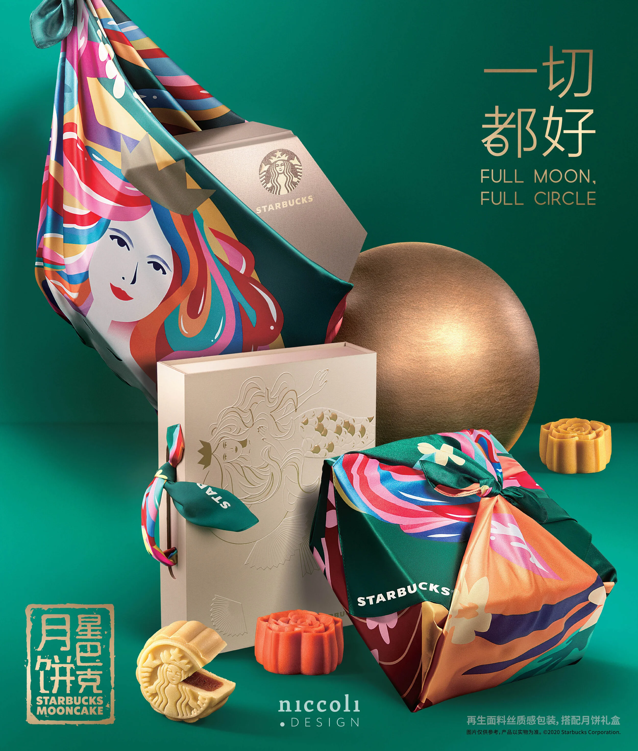
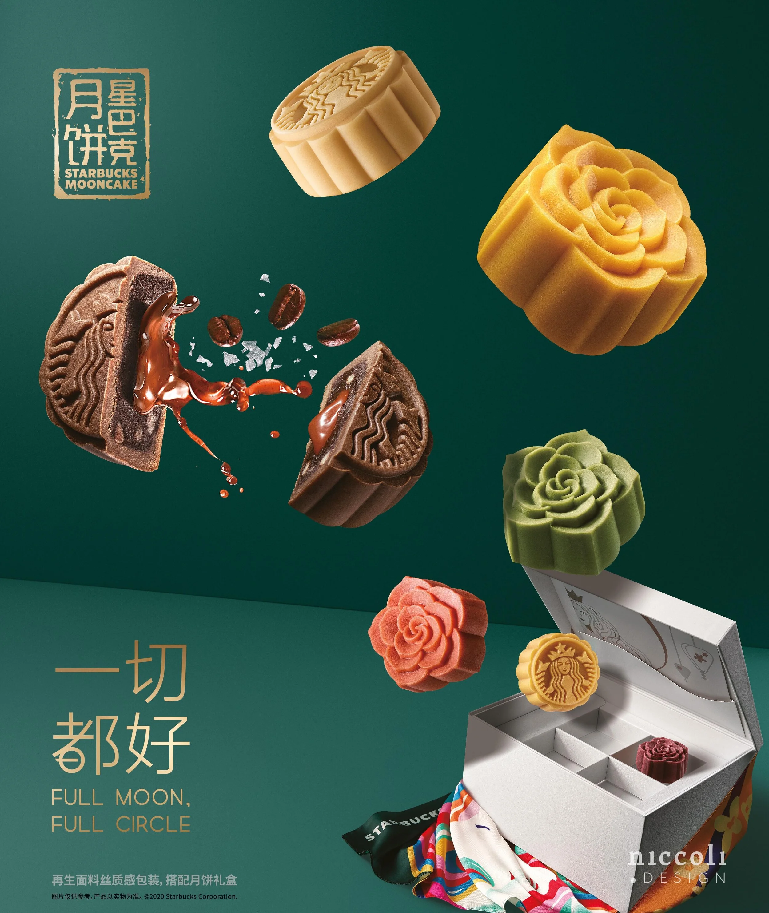
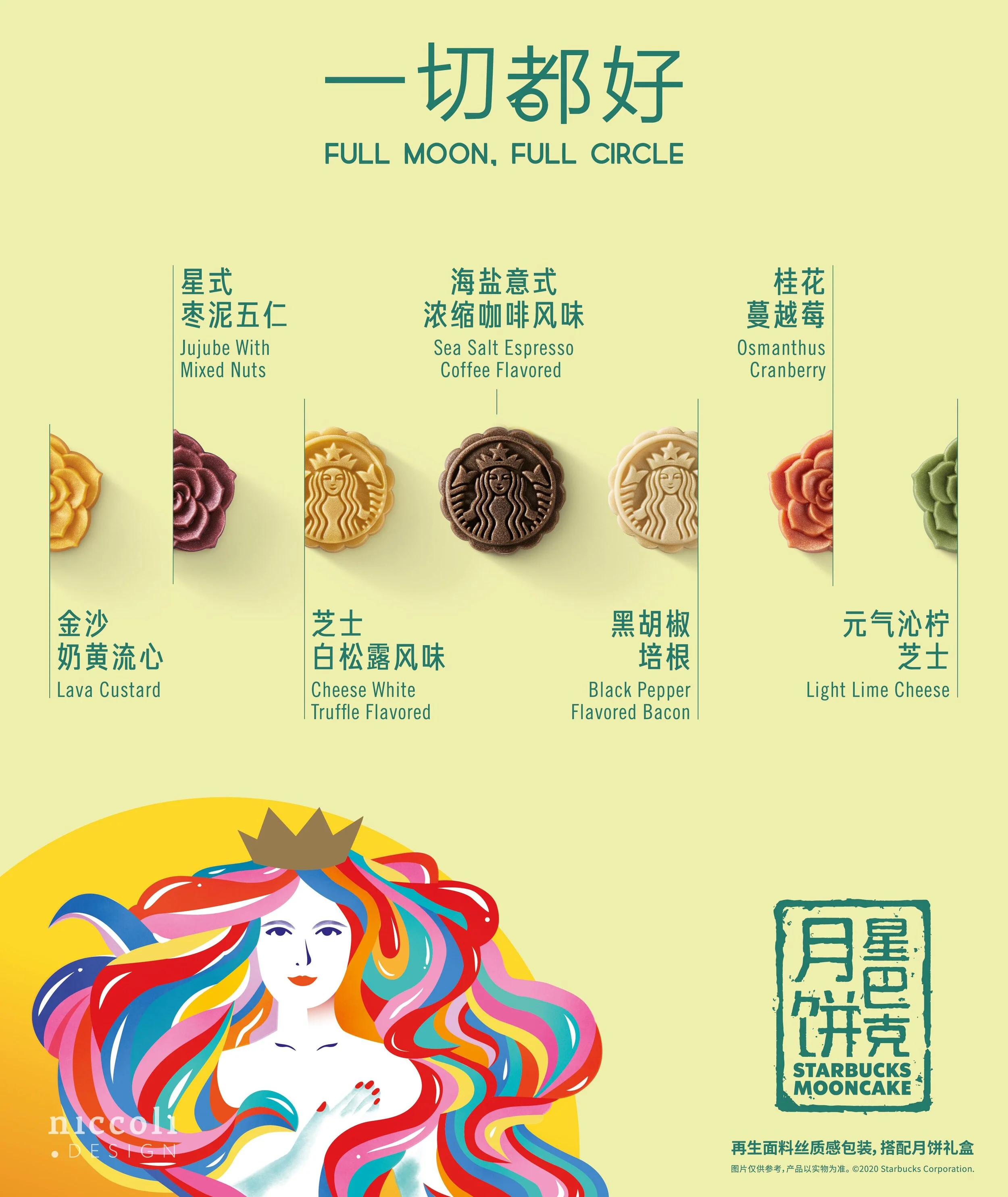
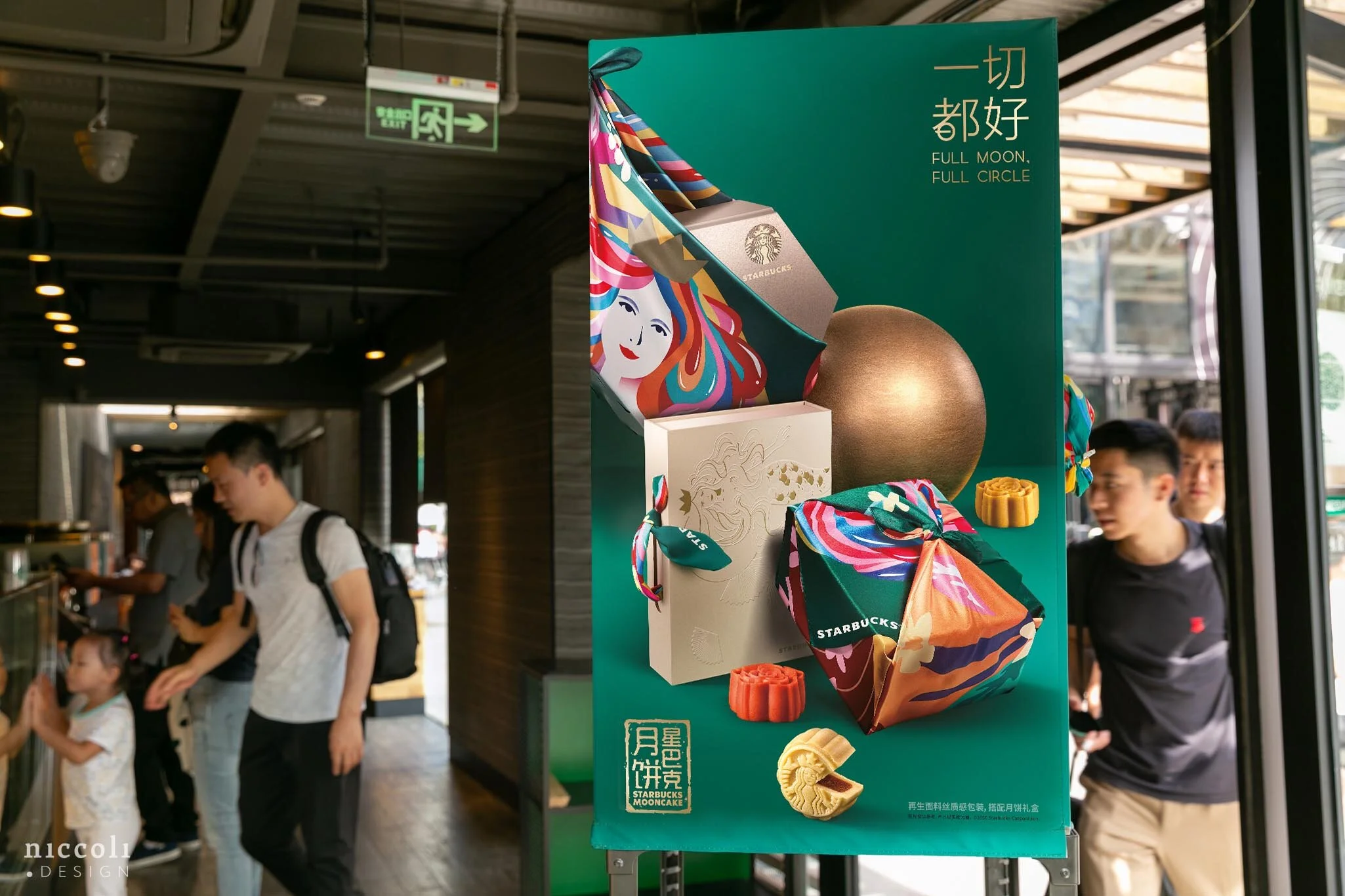
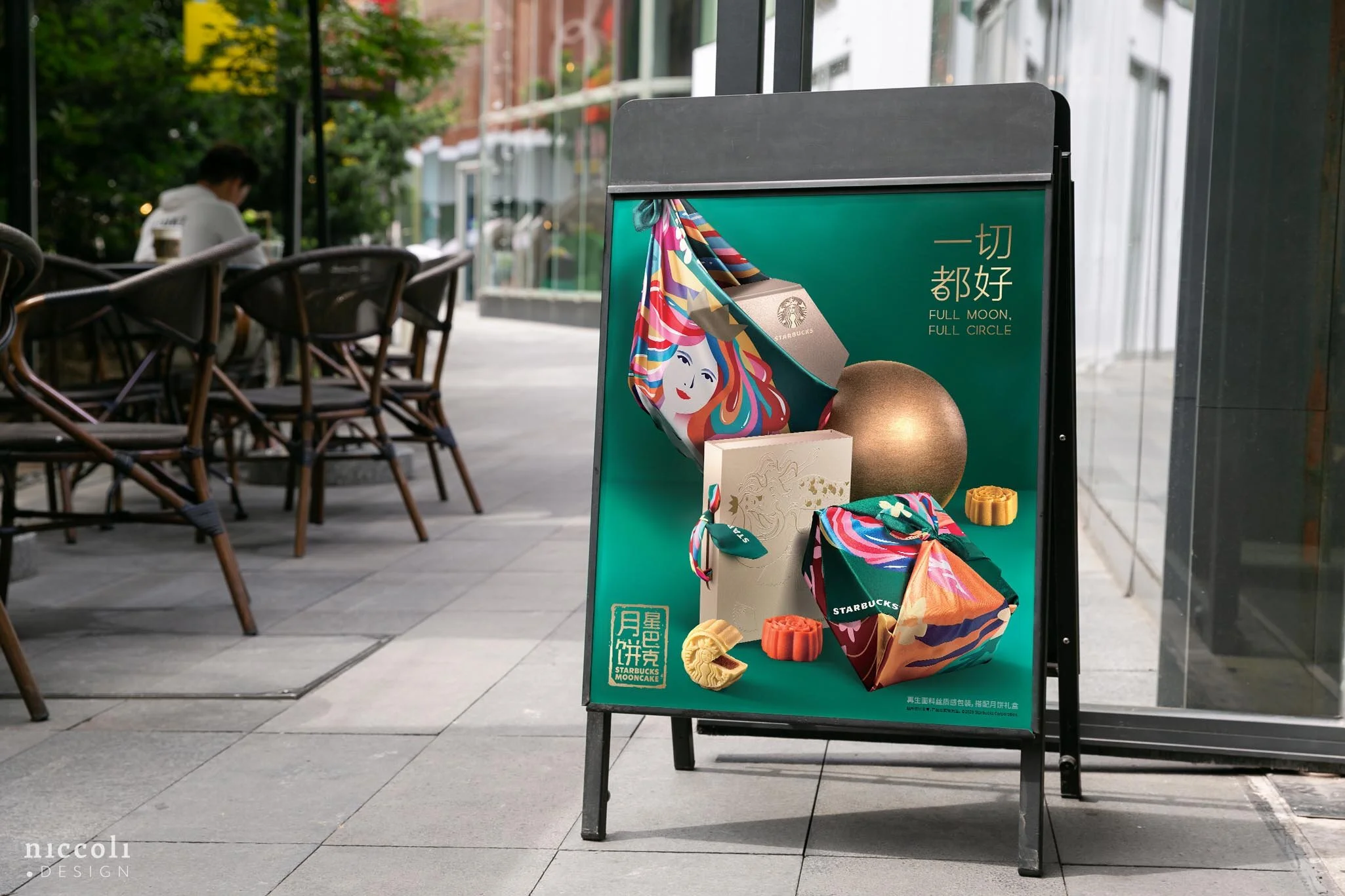
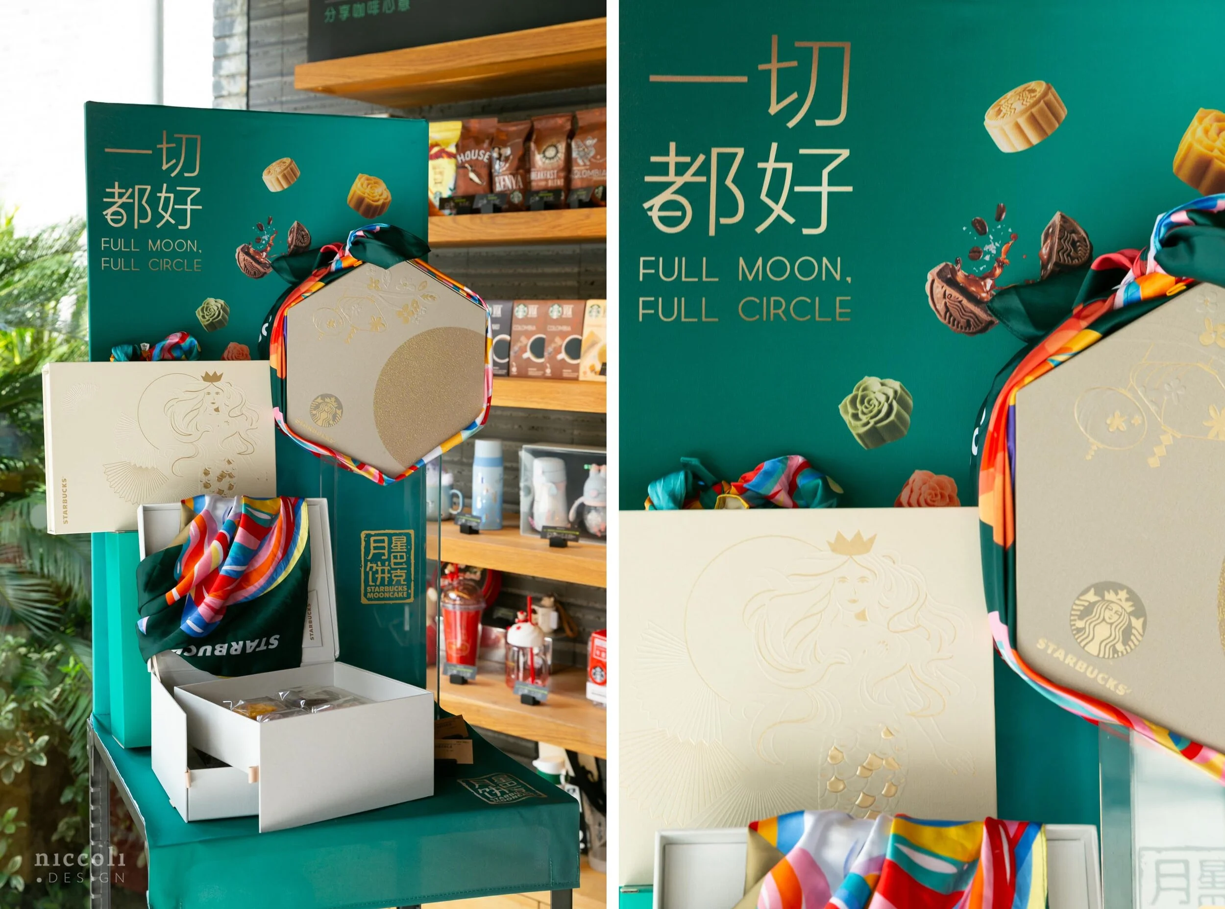
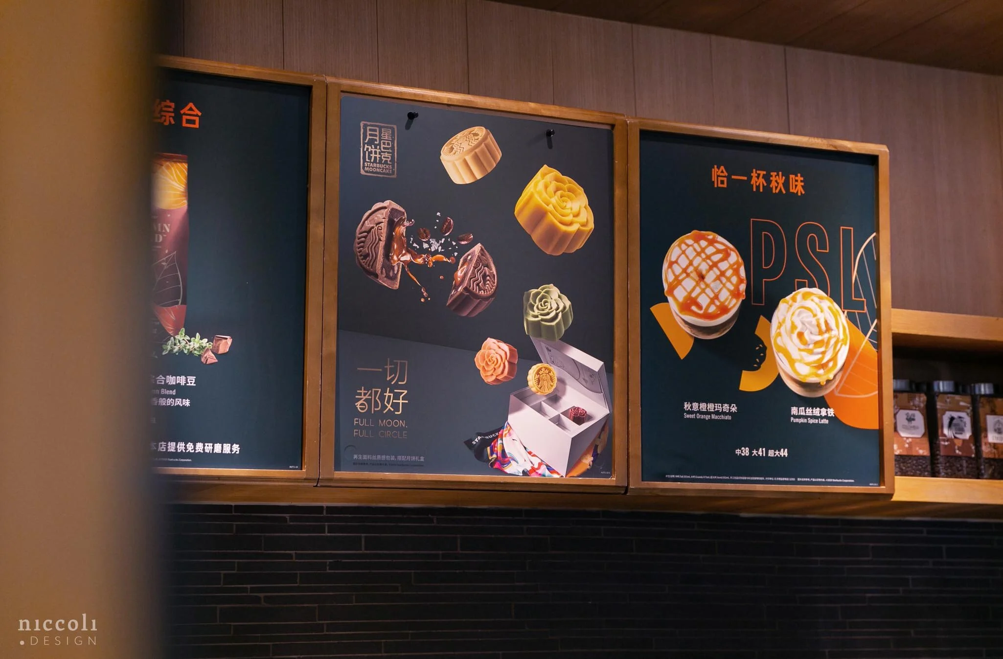
Ad campaign and visual merchandising for the Mid-Autumn Festival to promote new mooncake flavours and three-tier packaging. The design approach emphasized lightness, sophistication, and packaging showcase, with seven flavors represented through lunar phases.
Outcome
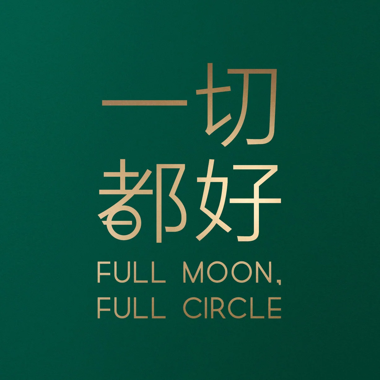
A lockup logo meaning “Everything goes well” with dual-meaning Chinese characters was created alongside campaign visuals that integrate a kerchief as a shopping bag replacement, reinforcing the brand’s sustainability messaging while celebrating the cultural tradition.
Client
Starbucks China
Creative Direction
Niccoli.Design