


Mid-Autumn campaign and mooncake packaging design for Starbucks.
As research shows, festival celebration and gift presenting have become the main driving factors of mooncake consumption. More than half of the consumers buy mooncakes for giving gifts to relatives and friends, or for business partners.
The design of the premium gifts has a minimal look and an appealing colour palette, while a hint of a surprise effect comes out from an oblique cut of the surface.
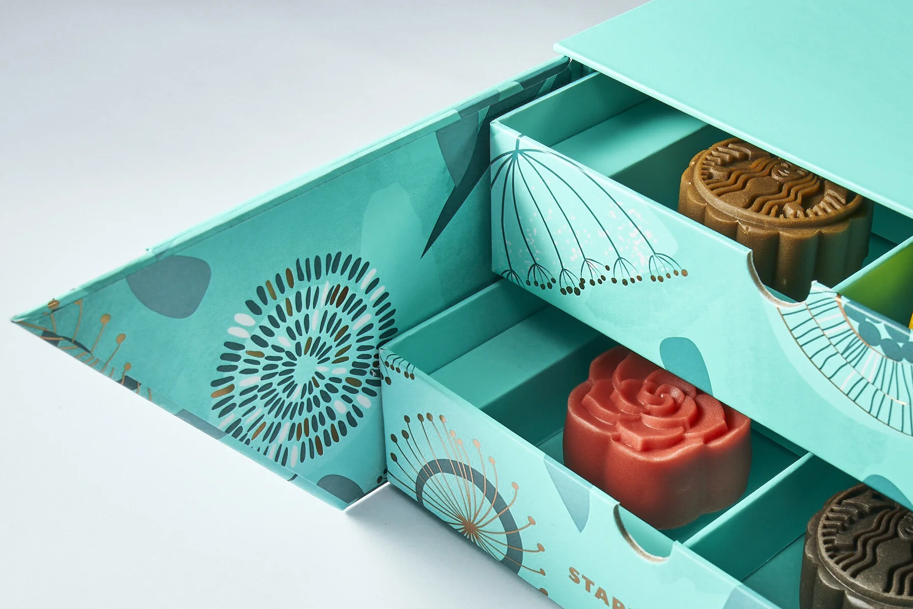
Opening the boxes, the customer is overwhelmed by the sophisticated and abstract flowery pattern, that follows the same colour palette as the outer surfaces, emphasised by a touch of gold hot foil.
All the boxes embrace the brand’s “green” approach, by using renewable materials and giving a second life to each of them: Tall becomes a document folder and a phone stand; Grande is a chest of drawers with a built-in speaker; Venti is a laptop stand and office stationery holder.
Client: Starbucks China
Packaging Art Direction: Niccoli.Design
Boxes design: Starbucks R&D