


Ad campaign and visual merchandising for the Mid-Autumn Festival to promote the new mooncake flavours and the three-tier packaging.
The myth
The origin of the festival comes from the myth of the goddess Chang’e, who flew to the moon to save the elixir destined for her husband, the hero Hou Yi. When Yi realised she was gone, he took her favourite food (the mooncakes) to an altar and offered it as a sacrifice for her. After hearing that Chang’e became a goddess, folk people also offered sacrifices to her to pray for peace and good luck. Since then, people from all over China reunite and celebrate this festivity together, exchanging and eating mooncakes.
The concept
The design recreates the lightness and sophistication of Chang’e, and at the same time emphasises the new mooncake packaging and its kerchiefs.
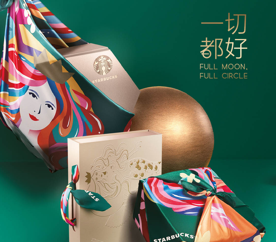
The main key visual showcases the 3 boxes; the moon is the shiny golden ball that connects and balances all the elements in a twisted “dance” towards the sky. The KV emphasises both the boxes and the way to carry them through the kerchiefs, replacing the shopping bag.
The KV above is meant to be displayed inside the shops: it showcases the mooncakes jumping dynamically out from the packaging, up toward the moon.
This KV shows the 7 flavours through the lunar phases.
The lockup logo means “Everything goes well” and plays with the double meaning/pronunciation of the character 㘦 (qiē means “cut/slice”, qiè means “be close to”). The idea comes from the custom of cutting mooncakes into slices before eating them. This concept is further emphasised by the lettering of the character 都 that shows a circle that is about to be cut.
The merchandise climbs up towards the moon, while showcases the mooncakes and the kerchiefs.
Client: Starbucks
Creative Direction: Niccoli.Design