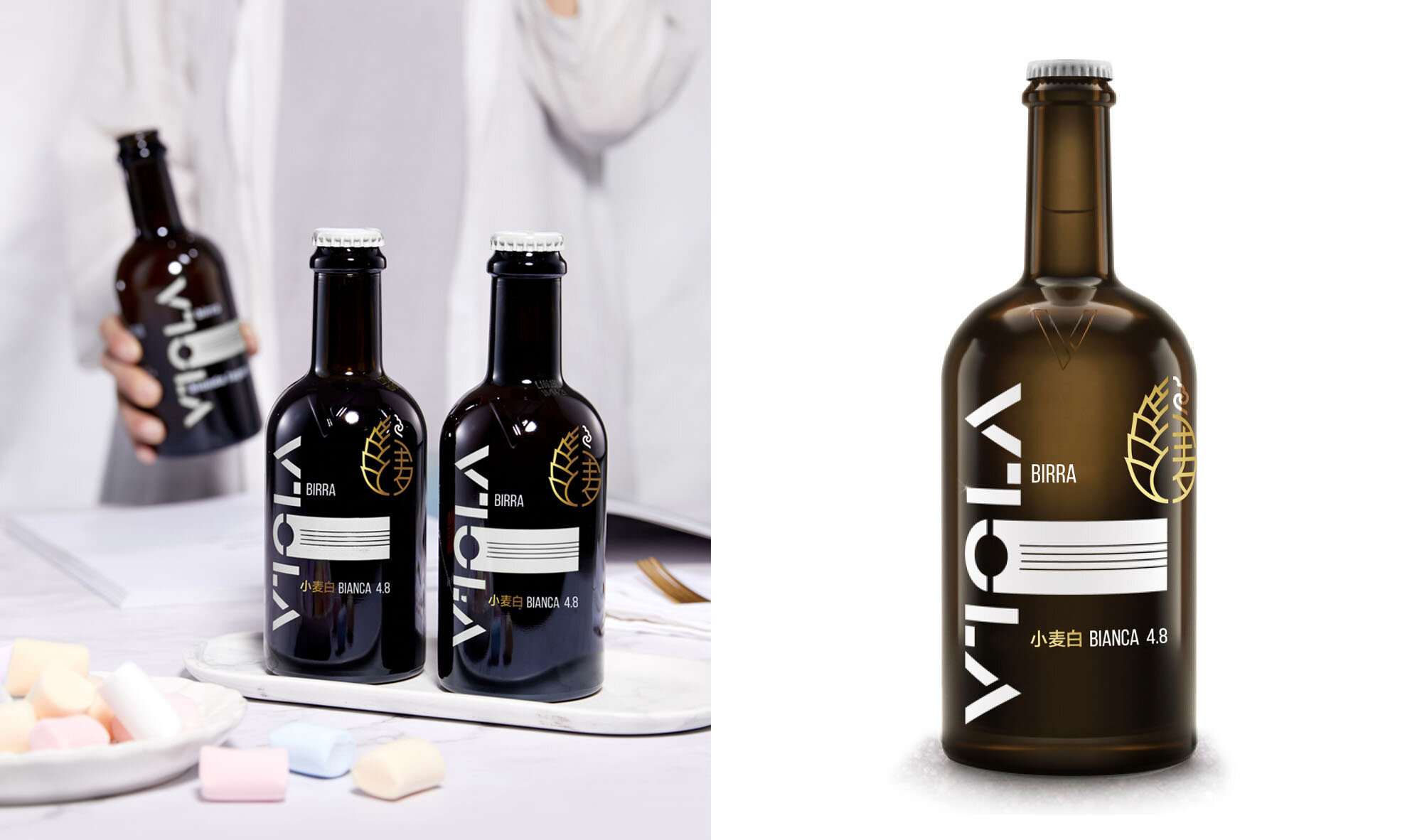


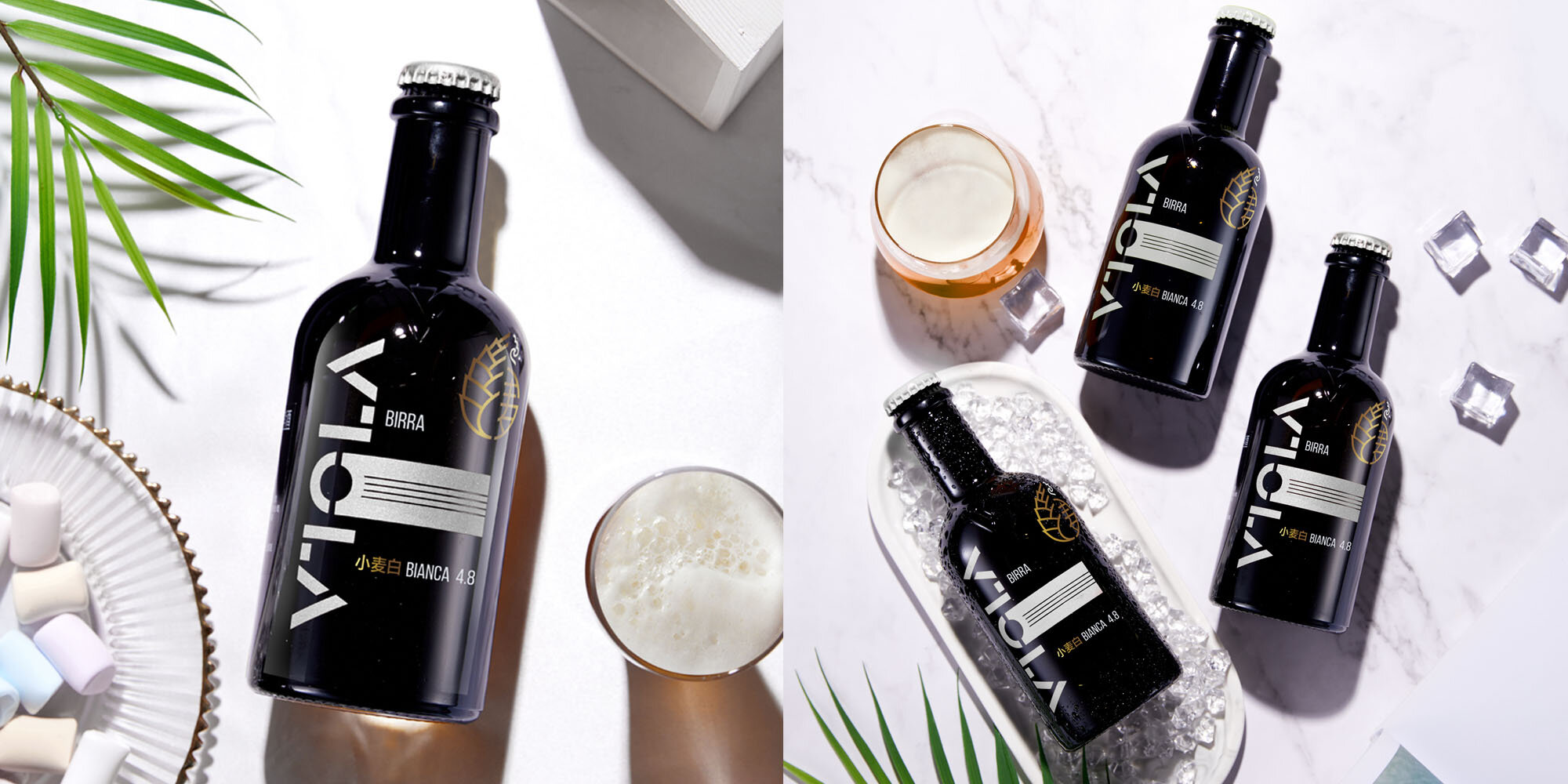


Viola is an Italian craft beer, especially popular abroad. For the Chinese market they decided to produce a new recipe closer to the local taste and entirely produced with local ingredients. The first of the new line of beers comes from Inner Mongolia.
They asked Niccoli.Design for a repositioning that makes them perceived as premium, while expanding their market to local customers.
A deep study of the Chinese young generation and the current market trends, made us come up with a mark that connects the local roots with the beer lovers hype trend: the golden icon of the hop is combined with the Chinese character 麦 (wheat), in a symmetrical hug. The hop emphasizes the importance of having selected ingredients to produce quality craft beer. The Chinese name conveys the message that it’s targeted to the local market.
Beside the golden logo, a little white mark completes the mirror reflection, adding a touch of Inner Mongolia to the logo.
We helped the brand in redefining their positioning, through the naming and the creative concept, applied to the packaging and the advertising.
Client: Viola
Creative Director: Ilaria Niccoli